If you are like almost everyone else in the world you have Google Analytics installed on your site. I am sure you, like me, monitor your traffic daily; looking for trends and patterns. Who doesn’t, right? But did you know that Google Analytics had a Chrome extension? It is actually pretty awesome and can be used to fine tune your website.
Getting the extension
Getting the extension is pretty simple, you can just go to the Google Chrome Store and install it from there. Once you get it installed you might have to log into your Google Analytics account. It depends on if it picks up the cookie automatically or not.
Using the extension
Using the extension is quite simple, one you are logged in, it should automatically show up at the top of your screen when you are on your site. You should get a grey bar like in the image above on your site.
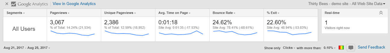
It just gives you a few of the basic analytics stats. There are two areas of interest in the the bar. The bottom left of the bar lets you set a date range to filter by, the other area of importance is the right hand corner. The multi-colored box shows click areas and the chat box shows the bubble with the click percentages.
Ok, so what?
You might be thinking that you can see this data in your normal Google Analytics account, which is true. But the way the data is organized in Google Analytics is not optimal for what we are about to do. We are going to start exploring conversion optimization and creating a better user experience. First we should take a look at the popular products on our demo site home page. Take a look at the image below.

The bubbles next to the products are from the Google Analytics extension, they represent the click rate of the links on the page. If you look in the second row, you can see that the yellow mug is getting 20% of the clicks on the page. Then if you look in the top row right corner, you can see the tin mug has not gotten any clicks. For a better user experience and to help optimize conversions we should move the yellow mug to a more prominent position on the page so that our customers can see it sooner, since it is getting a higher click rate. It’s generally a good practice to present people with options they are likelier to click higher on the page, so they do not leave the page without seeing what they are looking for. Now let us look at the top of the home page.
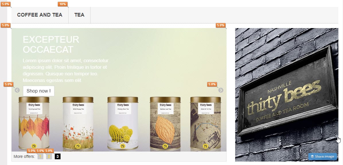
We can discern town things from looking at this view. First being that the image to the right of the slider is not getting any clicks. If this were a live site we would want to change this image out with something more compelling so our potential customers might click through to another page. Another interesting stat in this image is that the tea category is getting more clicks than anything else. This tells us that people that visit our site are interested in tea. We might change the image that is not performing out with a tea product, or an image that might go to a tea sub category.
Now we should take a look at the tea category to see if there are any optimization chances there. Below is a screenshot of the category.
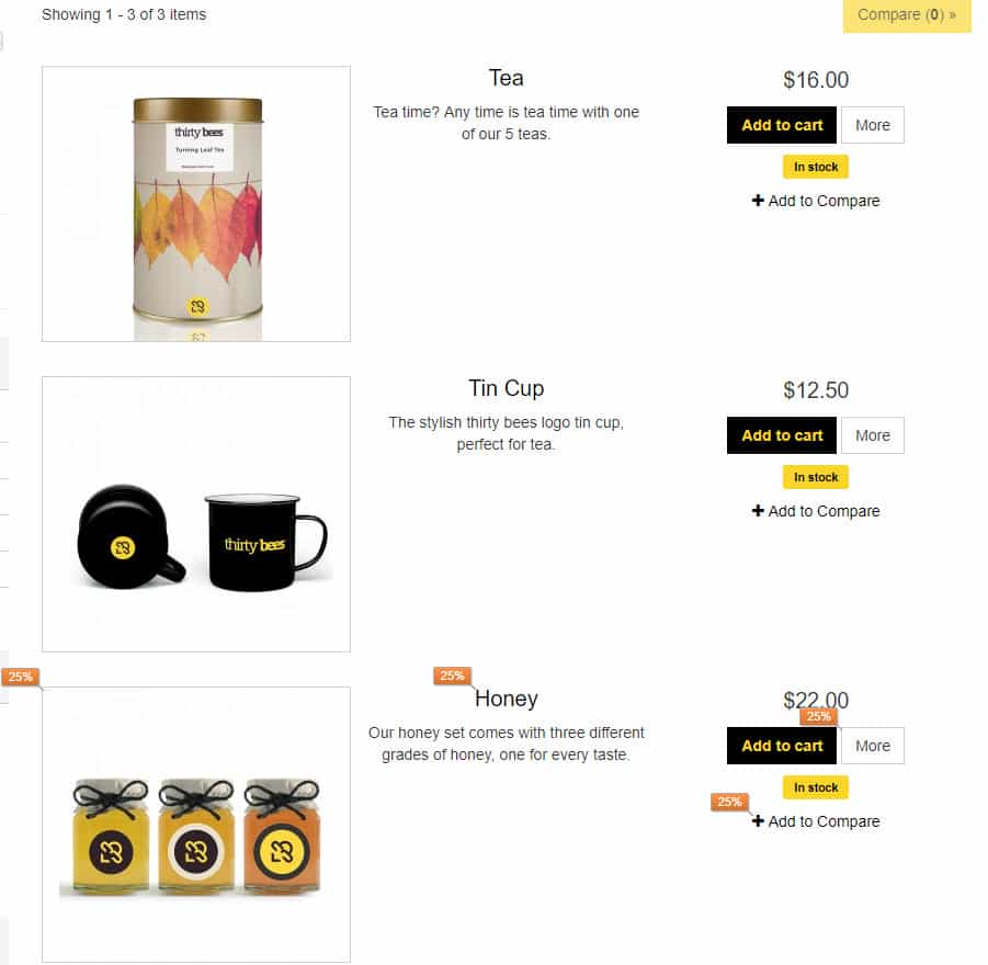
Looking at the image above we can see an issue. The product that gets the most clicks on the page is the last product. We should test out moving the product to the top of the list and revisit the analytics. Likely we will see an increase in clicks for the product and an increase in conversions as well.
Conclusion
Using the Google Analytics plugin you can start dissecting the major landing pages of your site, you can see what is performing as expected and what is not performing. Testing different banners, product placement, menu configurations, and other link placement you can not only optimize the user experience you can increase your sites conversions as well. People will no longer leave your site because they feel it is not relevant to what they are looking for, they will see what they are looking for and potentially purchase it.