For the last 20 years “Above the fold” has been pressed into the minds of web developers and designers, for no reason. There is no fold. There, I said it. In the words of Rick Sanchez “gotta rip that band-aid off now, you’ll thank me for it later”. It is not the nineties anymore, so we need to stop designing sites for the nineties.
In the early days of web design and mobile web design, designers and researchers were afraid that users would not know how to scroll down on a site or simply would not scroll down on a site. Years of extensive research have proven this ideology incorrect. The vast, vast majority of users can and will scroll on a website if there is a need for them to.
The term “Above the fold” actually translates from print media, newspapers to be more specific. With newspapers the term still makes sense. Imagine yourself considering buying a newspaper, take a look at the image below.

This is where above the fold comes from. You have to pay to see below the fold. This does not translate to digital. This does not translate to how the average user uses websites these days. Popular sites like Twitter, Facebook, and Reddit, they all have infinite scrolling. If users only looked at what was above the fold these sites would shutter. Users know how to scroll, they have been scrolling for years.
The “Above the fold” mentality actually creates more problems than it does solutions. There is not even a consensus of what the fold actually is. With literally hundreds of different devices, different screen sizes, that would mean there are hundreds of different folds. Oh, wait, let’s flip the devices and multiply that by two now. When consulting for my clients, one fall back I find myself using is to look at industry standards. What are the big guys doing? Why are they doing it? Do they know something we don’t?
A look around the web
If we take a look at some of the largest e-commerce website’s mobile versions, we can see how they treat the fold. We are starting with the mobile view, because currently it represents more than half of all Google traffic. Most of these sites we are going to look at consider the other sites we are looking at as major competitors. This gives us a unique insight into what they might think gives them an edge over another site. For this first round of screenshots we are using iPhone 6 in portrait mode.
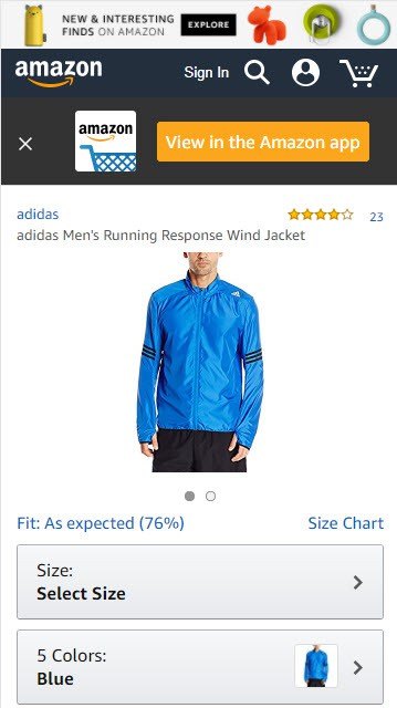

The above images are product pages to some of the most popular e-commerce sites around the world. Do you notice anything about the product pages? The above the fold content is missing one key element to all e-commerce sites. Not one of them has an add to cart button.
If above the fold content was so crucial to conversions on e-commerce websites, wouldn’t at least one of these sites have an add to cart button above the fold? I would think so.
There is no fold
Earlier this year, Clicktale, a heat mapping and analytics company released a great blog post on their findings concerning user’s scrolling. They measured 120,000 views over a month and came up with this: “Overall, we saw that 91% of page views were on pages that had a scroll bar. Of those, 76% included some scrolling action, and 22% were scrolled to the bottom of the page.” 76% percent of users scrolling is pretty compelling. Especially when you add it to the fact that the user could have found what they were looking for in the main navigation of the site as well. Another interesting point they made in the article was that there is no true metric for the fold. Of any given screen resolution, less that 10% of of devices used the same resolution. So that means the fold is all over the map. For more information read their article titled Unfolding the insights into webpage scroll.
What about home pages?
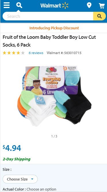
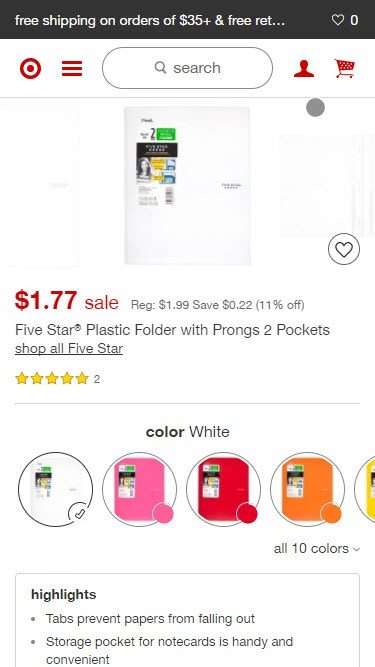
There has been a lot of discussion in recent years about whether to forgo using a slider on mobile, so that the actual products can be pushed up higher on the homepage. Sounds like a reasonable assumption, but let us see how the same sites actually lay out their home pages.


Not surprisingly we see every one of the above sites using a slider. Some like Amazon and Walmart are poorly scaled to minimize their presence. While Target’s takes up the whole page and Zalando’s takes up almost half the available page. What above the fold strategy sticks out for all four sites? If you scroll up and look at all 4 sites again, you can see that the strategy is not above the fold. The strategy is the first 200 pixels. In the first 200 pixels every site displays a clear navigation and a search bar. Target even reduces their name to just their logo symbol to gain more space.
As the above the fold strategy crumbles more, we can start to see the new strategy, the top 200. This is the new above the fold on mobile. This is fine for layouts, but there is another side to above the fold. The term is not just used for content displaying on a page. It is also in the last few years became a performance term as well. Google wants us to prioritize above the fold content in loading pages.
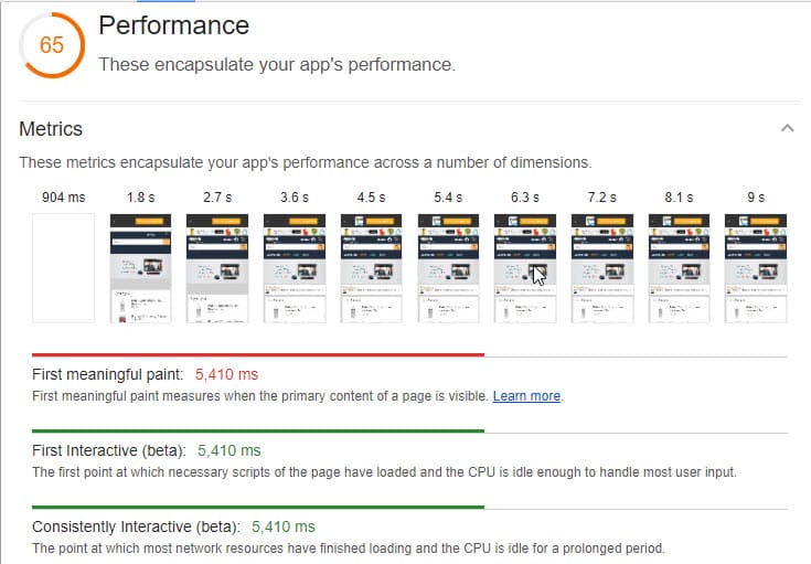
Again we are going to use the same four sites, just to keep everything consistent. Keep in mind these are all sites with huge development budgets, all running custom frameworks to achieve the results they are pushing for. Even with that, I think the results are pretty surprising.
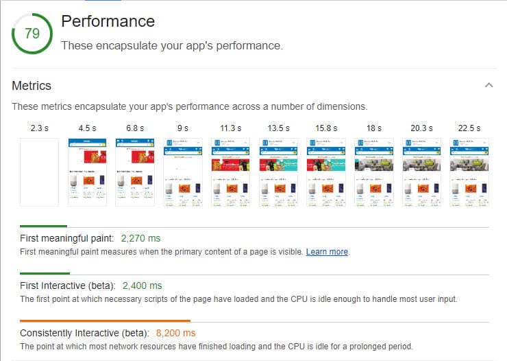
Amazon
Walmart
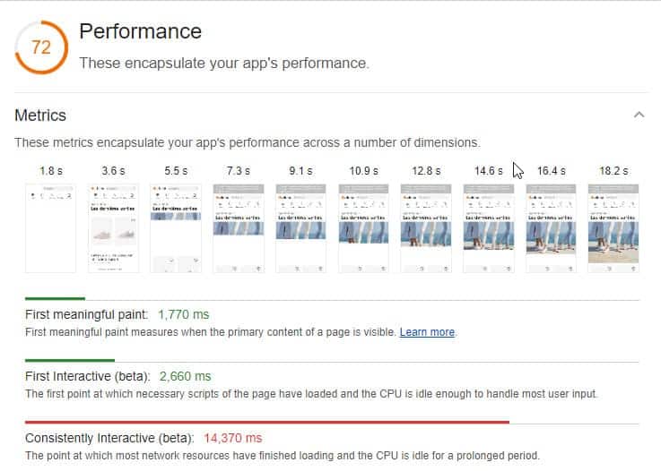
Zalando
Target

To me these results are very surprising. None of them perform well. If you read our last article title PageSpeed is Dead, you might notice that a couple of the demo site seem to perform even better than Amazon or Target. Looking at a couple of the sites you might not even think they have a mobile strategy. From the test above, the only site that even comes close to prioritizing the above the fold page loading speed is Zalando. It has a nice first paint and a great first interactive as well. But then it loses greatly with with the consistently interactive, it remains downloading the page for almost 15 seconds. Even though this article is about above the fold content, I did want to see how the sites performed. One thing to note, above the fold is not to be confused with the rendering term prioritizing visual content. Those are two different theories entirely. One is about content placement and the latter is about the loading time of the content.
Conclusion
If you look at most major e-commerce sites on mobile devices, it is pretty obvious that above the is not something that is taken into consideration too much, with the exception of the top 200 pixels. More time is spent on a cleaner layout that organizes information into logical places. Not cramming everything you can into the above the fold area on the home or product pages. That is why all of the sites that were shown did not have add to cart buttons above the fold. It would break the layout and cram the view port, making things too busy. One of the best quotes about users scrolling that I came across is from Twitter user Luke Wroblewski. It says “Scrolling is a continuation, clicking is a decision”. Users have been trained to scroll these days. Prioritize a clean, beautiful layout, not a layout that shoehorns in the most possible information into the smallest possible area.